CASE STUDY 03 / BRAND IDENTITY AND POSITIONING

NBC Bank

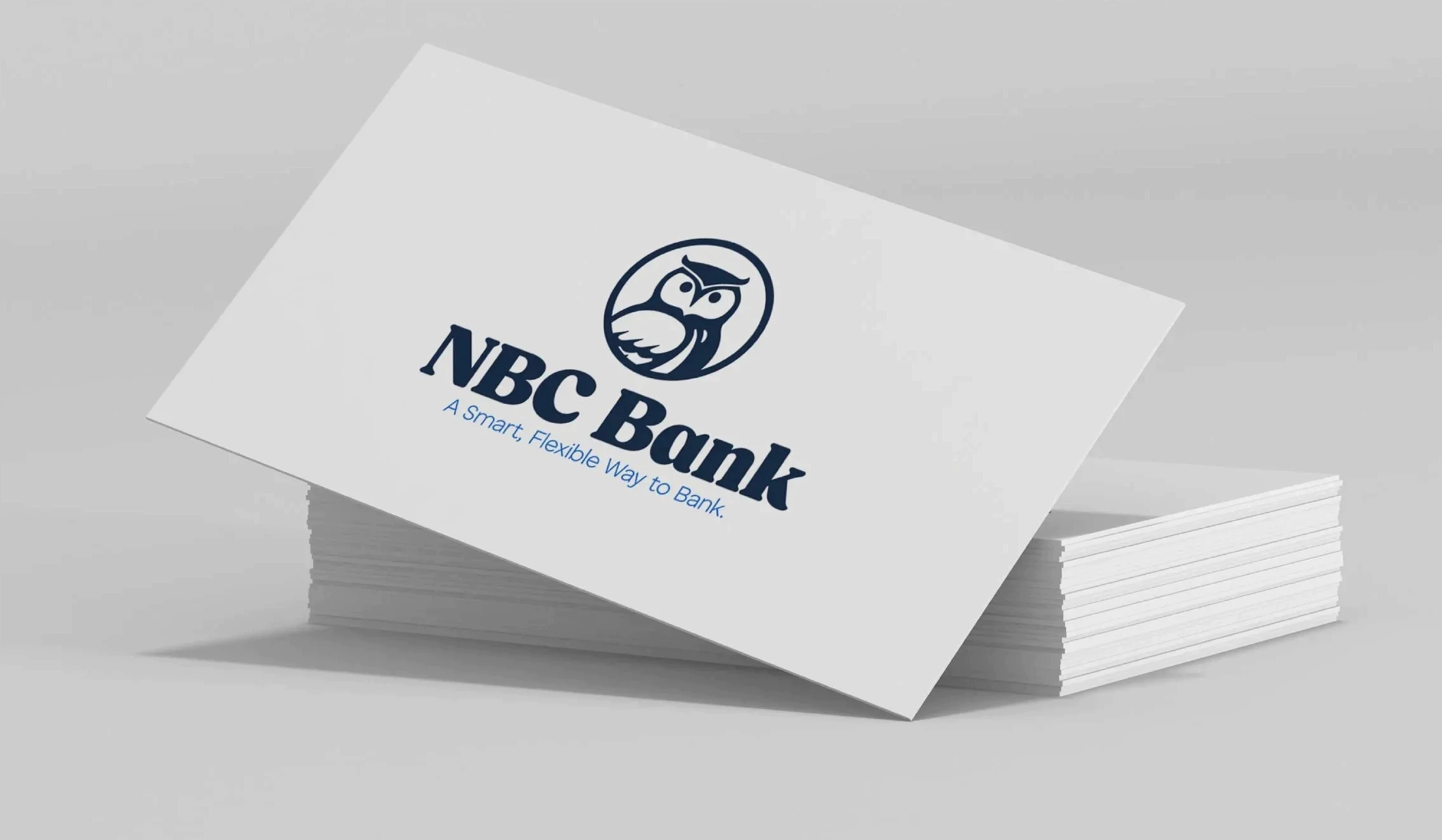
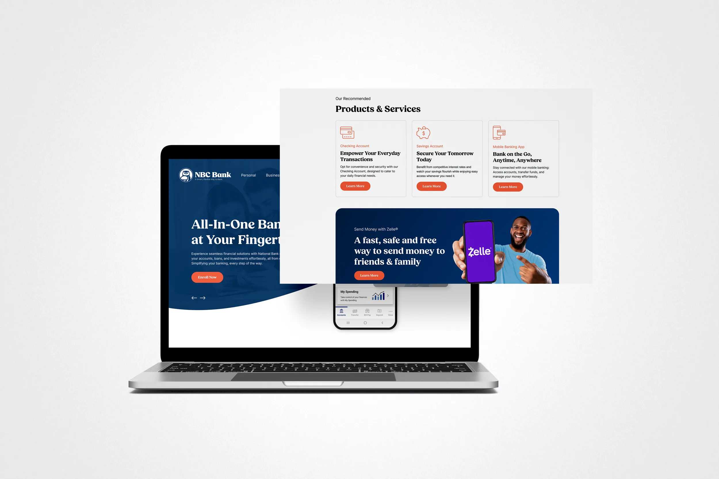
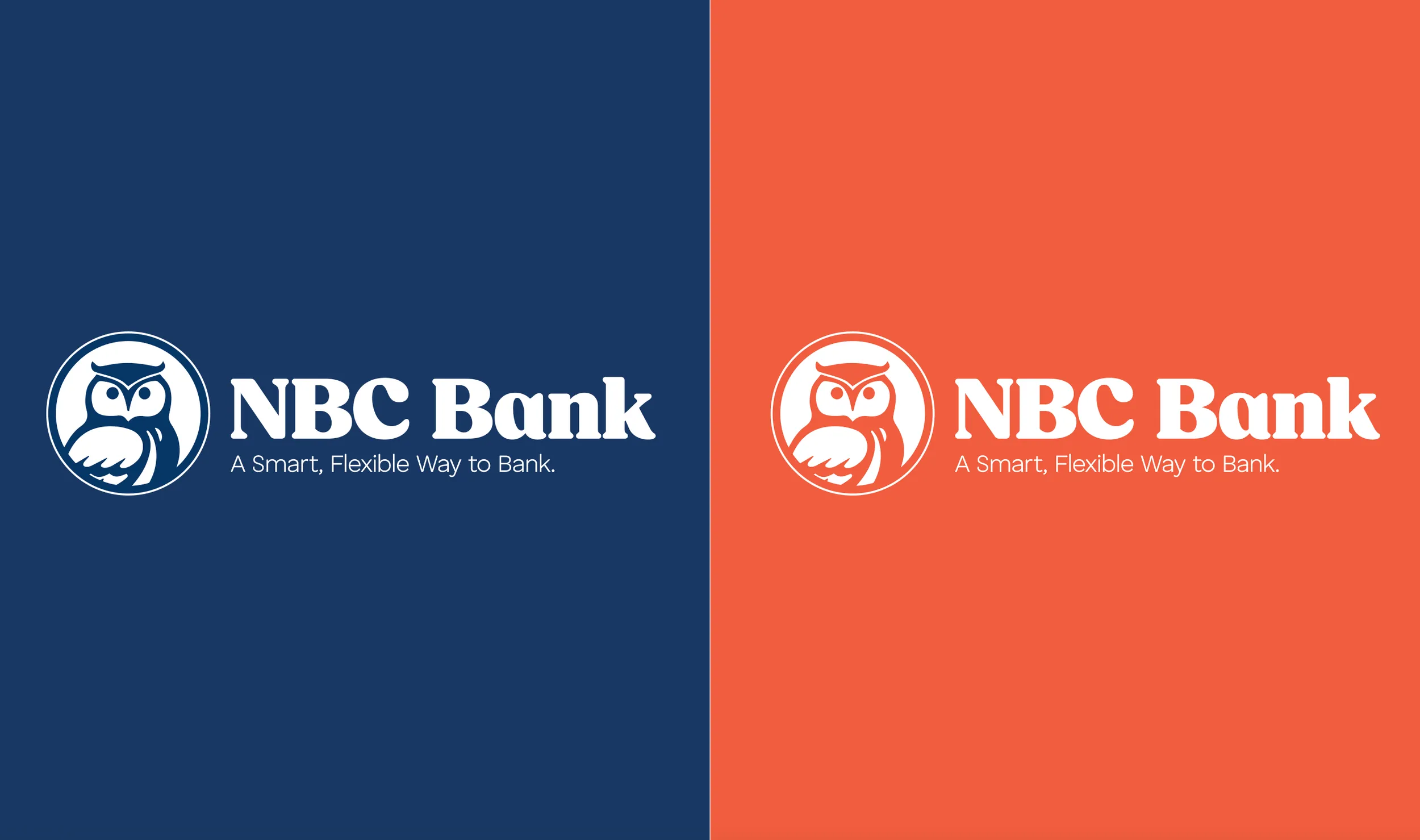
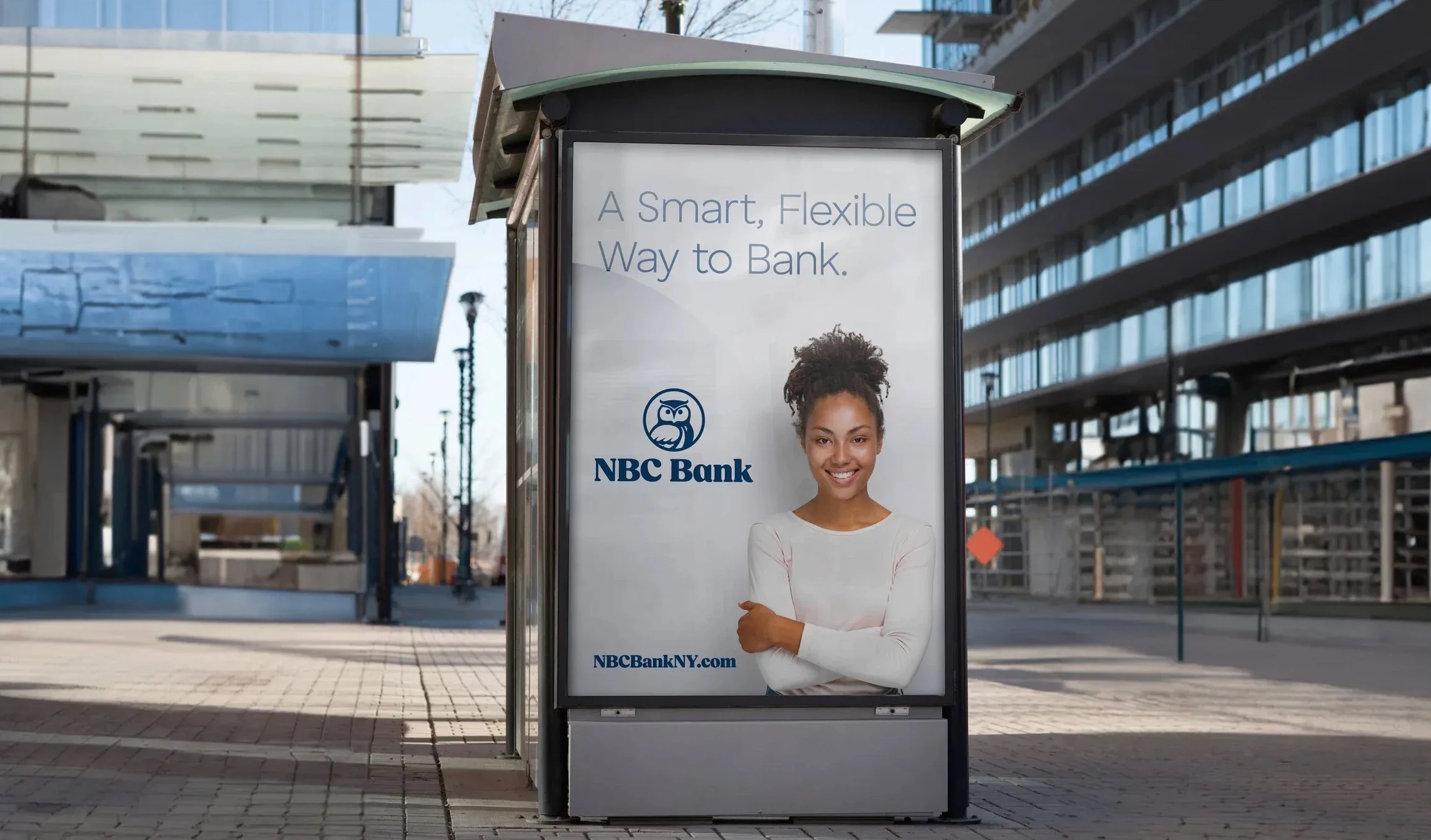
NBC Bank transitioned from it’s old name, National Bank of Coxsackie, to get away from a name that ties them to a specific region. We also updated their dated “owl” mark with a fresh, modern mark. The type gives it a friendly, approachable feel. Overall this rebrand was a necessary step forward for the bank to grow and modernize. As part of the rebrand, the website was also revamped to match the more modern, approachable brand. (NBC Bank recently went through a merger and unfortunately didn’t finalize the rebrand)

Client

NBC Bank

Role

Creative Director

Year

2023

Discipline

brand identity and positioning
01

The challenge
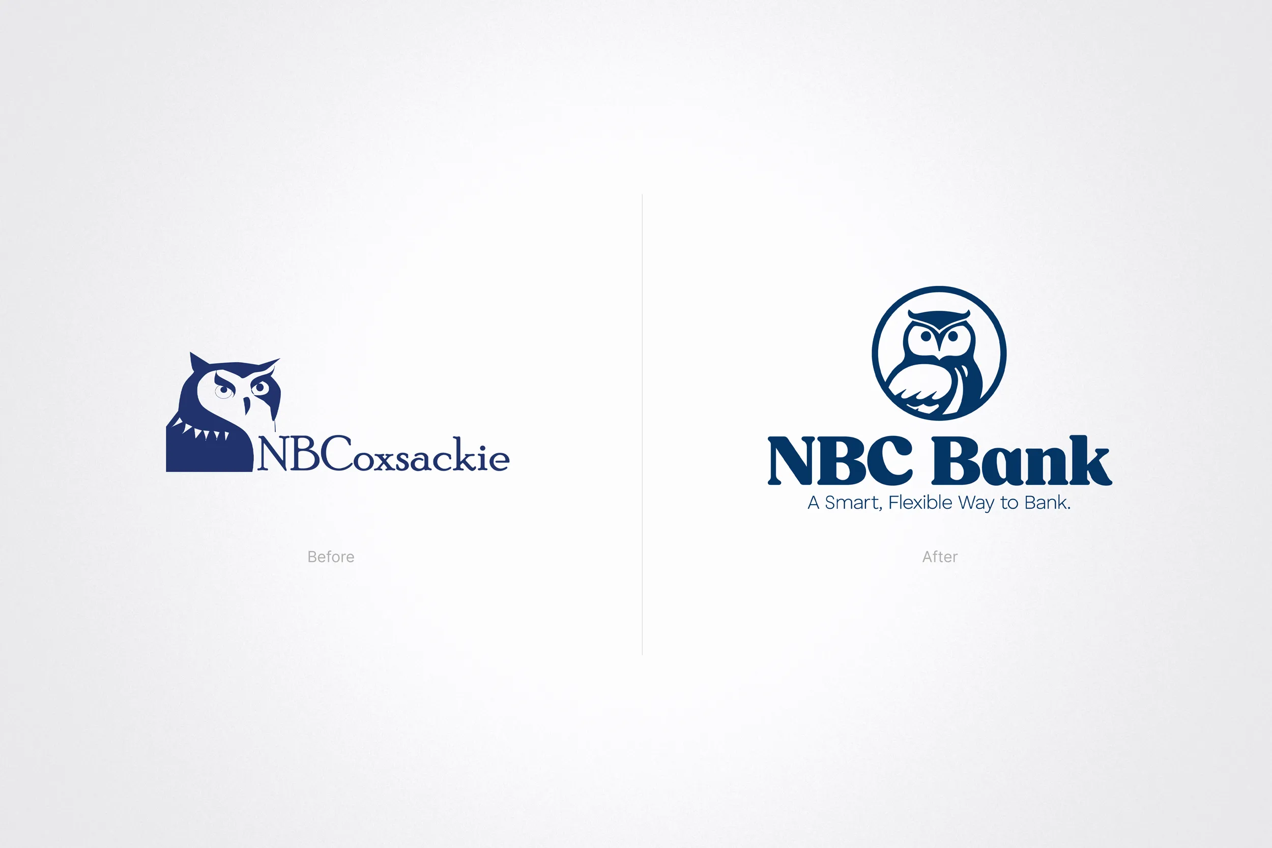
As National Bank of Coxsackie, the name tied the bank to a single town and the “owl” mark felt dated, both limiting growth into new markets.

As National Bank of Coxsackie, the name tied the bank to a single town and the “owl” mark felt dated—both limiting growth into new markets.

02

The approach

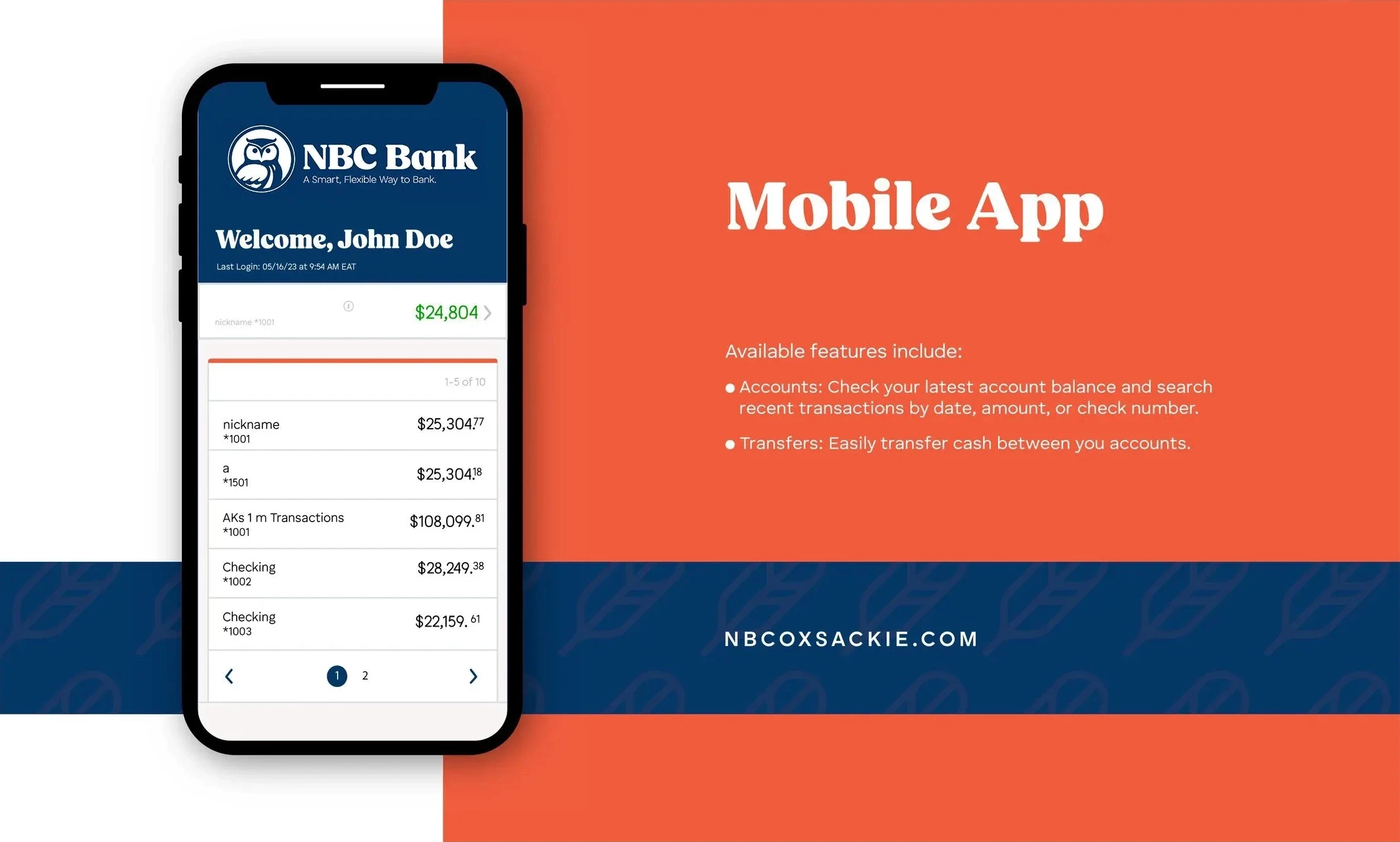
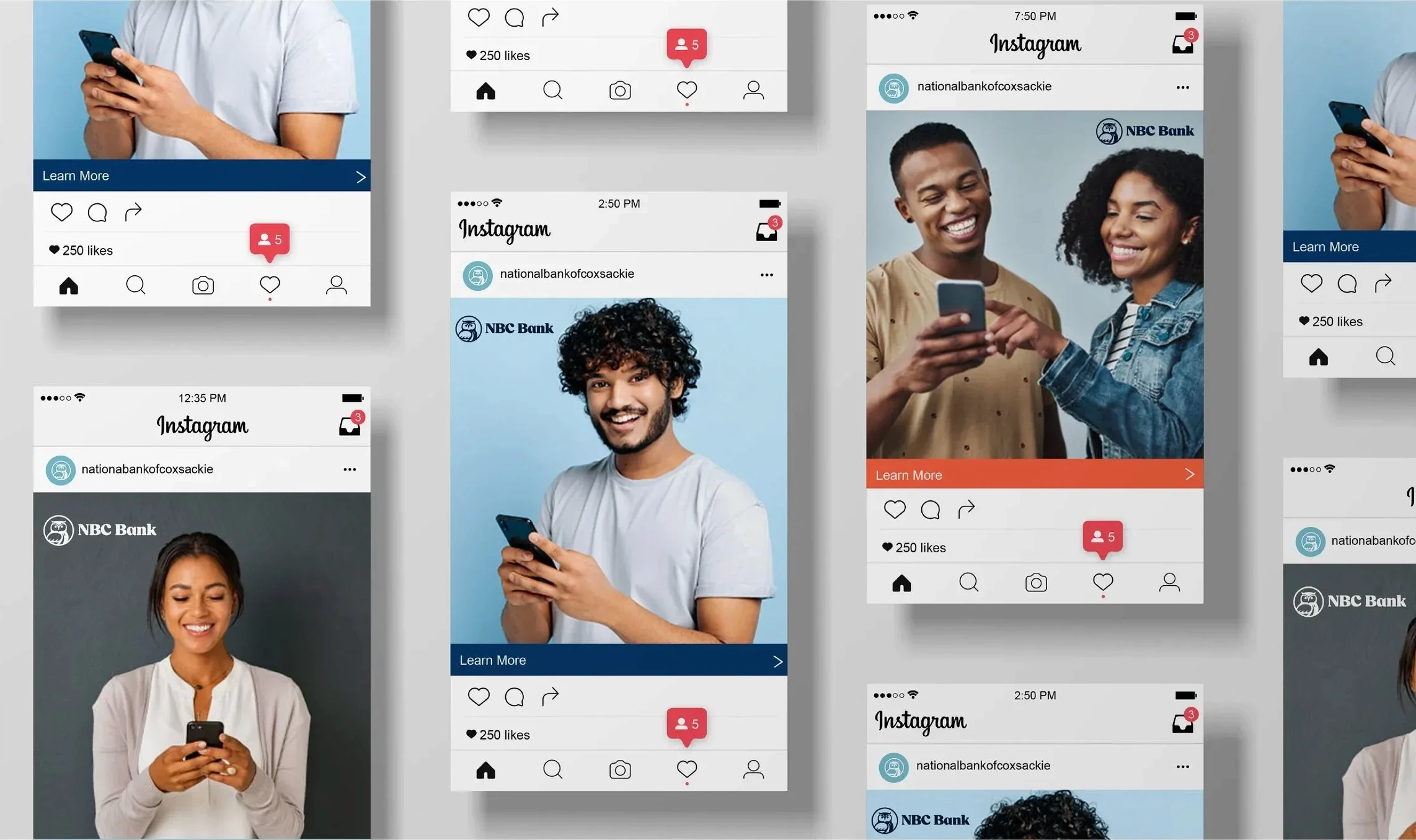
We shortened the name to NBC Bank and designed a fresh, modern mark, then extended it into a full identity system for signage, branches, print and digital.

We shortened the name to NBC Bank and designed a fresh, modern mark, then extended it into a full identity system for signage, branches, print and digital.

03

The outcome

A confident regional brand ready to grow beyond its roots while honoring decades of community trust.

A confident regional brand ready to grow beyond its roots while honoring decades of community trust.

NEXT CASE STUDY

University at Albany →