Murnane
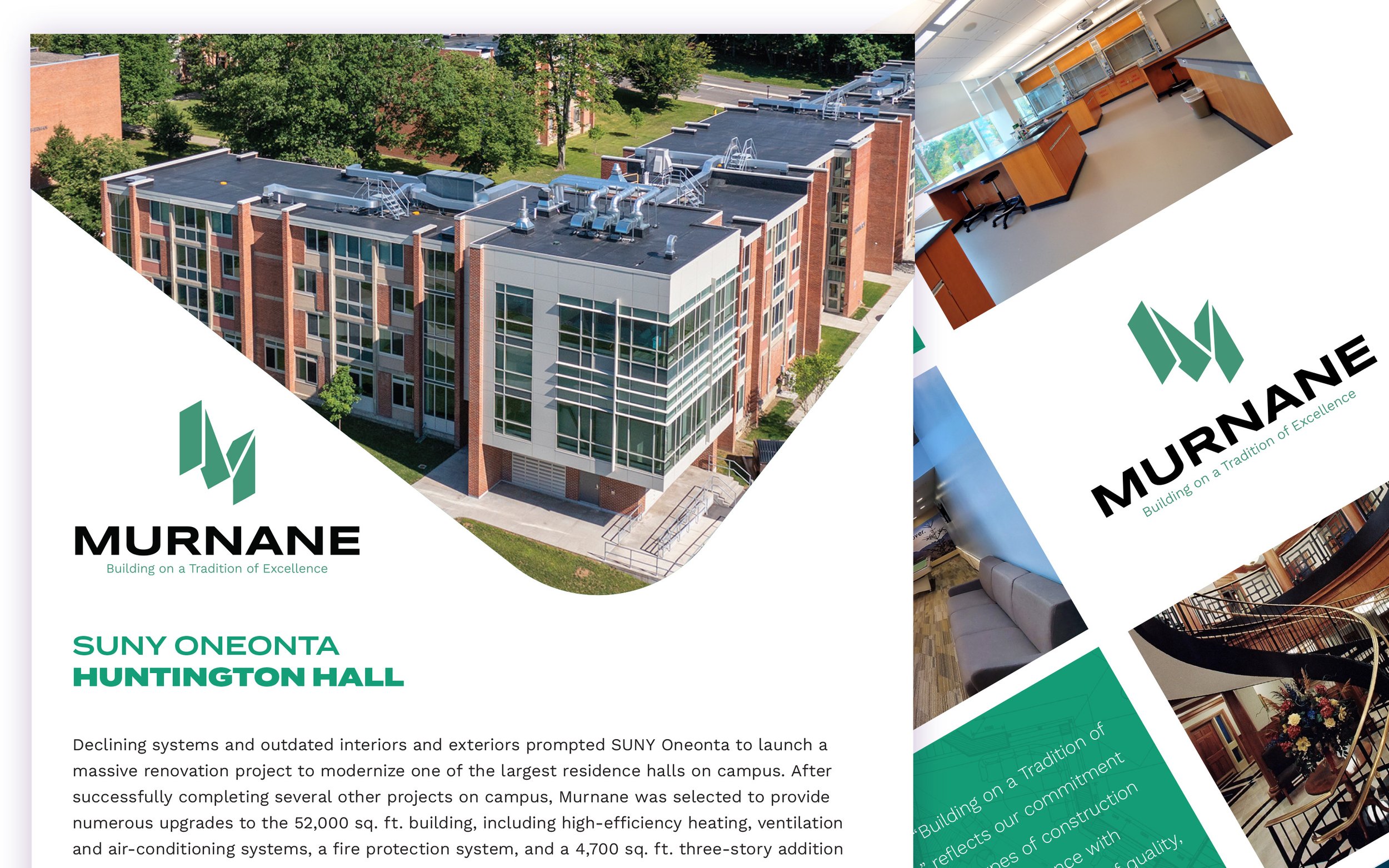
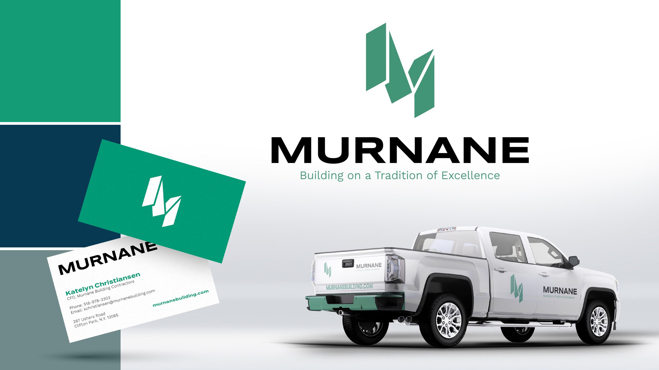
Murnane approached us at Elevation 10K with this project hoping to expand the Murnane brand to open the door to more opportunities in the private sector. In our discussions we agreed that removing the "Building Contractors" from the old logo mark was a necessary move to simplify and modernize the well established brand. After exploring new logo marks, the team decided on keeping the original “M” and pairing it with a new, strong and modern typeface. We also named a few new brand colors to add flexibility in print and web applications.
My role: Art Direction, Design/Branding
